

How the best physical exhibitions actually use digital curation principles
The Silent Dialogue Between the Screen and the Space
For decades, we viewed the physical gallery and the digital interface as two distinct realms. One was a sanctuary of the tactile, defined by the smell of oil paint and the echo of footsteps on hardwood floors. The other was a realm of pixels, light, and hyper-speed navigation. However, as we move deeper into an era where our visual literacy is shaped primarily by the scroll and the click, a fascinating metamorphosis is occurring. The most successful physical exhibitions are no longer ignoring the digital world; they are quietly adopting its most profound curation principles.
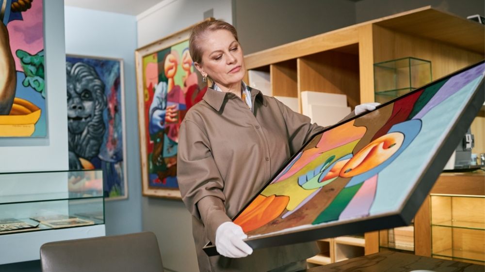
This focus on harmony helps curators create a balanced visual collection, ensuring that every element of the exhibition feels unified and purposeful.
To walk through a contemporary exhibition today is to experience a physical manifestation of a digital user journey. We see it in the way light is used to draw the eye, much like a call-to-action button, and in the way information is tiered to prevent cognitive overload. This reflection explores how the digital logic of curation has stepped out of the screen and into the three-dimensional world, creating a more resonant and intuitive experience for the modern observer.
The Algorithm of Space: Pathing and User Flow
In digital design, we speak of 'user flow'—the path a visitor takes through a website to reach a desired outcome. In the physical gallery, this has evolved into a sophisticated study of spatial algorithms. Curators now consider the 'scannability' of a room. Just as a web user skims a page for headers and bold text, a gallery visitor often scans a room for anchor pieces before committing to a deeper look.
The best physical exhibitions use these digital principles to guide the human body. They create 'high-traffic' focal points and 'dwell zones,' mirroring the heatmaps used by digital designers to track where eyes linger longest. By understanding the psychology of the scroll—the need for constant visual stimulation balanced with moments of rest—curators are designing spaces that feel both dynamic and manageable.
Predictive Movement and Visual Hierarchy
When we design a digital gallery, we rely on visual hierarchy to tell the story. We use size, color, and contrast to signal importance. Physical exhibitions have begun to lean into this digital instinct. A large-scale installation acts as an H1 heading, commanding immediate attention, while smaller sketches function as the supporting body text. This hierarchy ensures that the visitor never feels lost, providing a clear narrative thread that mimics the intuitive navigation of a well-designed app.
Metadata in the Material World: The Information Layer
One of the most significant digital principles being adopted by physical spaces is the concept of 'metadata.' In the digital realm, metadata provides context, searchability, and depth to an image. In the physical gallery, this translates to the 'information layer'—the way we bridge the gap between the object and its history.
We are seeing a shift away from the static, academic wall plaque toward more interactive, 'hyperlinked' experiences. This might include:
- QR Code Integration: Functioning as a 'Read More' button, allowing visitors to dive into the artist’s process or video archives.
- Augmented Reality (AR) Overlays: Providing a digital skin over physical objects to show their original state or hidden details.
- Tiered Labeling: Borrowing from web design’s 'progressive disclosure,' where basic info is visible at a glance, and deeper context is available for those who seek it.
This layered approach acknowledges that the modern visitor is used to having the world's information at their fingertips. By incorporating these digital layers, physical exhibitions provide a sense of depth that a singular physical object, however beautiful, sometimes struggles to convey on its own.
Modular Design and the Physical Grid
Digital curation relies heavily on the grid—a modular system that allows for flexibility, balance, and order. We see this principle reflected in the rise of modular exhibition design. Galleries are moving away from permanent, monolithic structures in favor of flexible systems that can be reconfigured, much like a CMS template.
This modularity allows curators to 'update' the physical space with the same agility as a digital homepage. It recognizes that the contemporary creative landscape moves quickly. By using modular walls, lighting, and digital displays, a gallery can pivot its narrative, responding to cultural shifts and new inspirations with a fluidity that was previously reserved for the virtual world.
The Aesthetic of the Feed
There is also an undeniable influence of the 'social media feed' on physical curation. The way artworks are grouped today often mirrors the aesthetic cohesion of a curated Instagram grid. There is a focus on color stories, thematic consistency, and 'Instagrammable' moments. While some purists argue this cheapens the art, others see it as a reflection of how we now perceive beauty: as a series of interconnected, visually harmonious fragments that tell a larger story when viewed as a whole.
Conclusion: The Convergence of Experience
As we reflect on the evolution of exhibition design, it becomes clear that the distinction between 'digital' and 'physical' is increasingly irrelevant. The best curators are those who understand that we are the same humans regardless of the medium. We crave clarity, we seek connection, and we navigate our world through a lens of visual storytelling.
By embracing digital curation principles—flow, metadata, hierarchy, and modularity—physical galleries are not losing their soul. Instead, they are becoming more accessible, more engaging, and more reflective of the way we live today. They are becoming spaces where the tactile meets the technological, creating a sanctuary that feels both ancient and entirely new. In this convergence, we find a new kind of creative inspiration, one that honors the past while leaning fearlessly into the digital future.

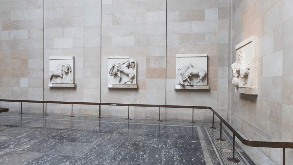
Creative Visual Composition: Building Cohesive Gallery-Style Layouts
Creative visual composition is essential for building gallery-style layouts that feel balanced, engaging, and professionally curated. Whether designing a digital gallery, portfolio, wall display, or presentation layout, cohesive composition helps unify individual visuals into a structured and compelling experience.
This article explores how creative visual composition supports cohesive gallery-style layouts and improves overall design presentation.
What Is Gallery-Style Visual Composition?
Gallery-style visual composition refers to arranging multiple visuals in a way that creates harmony, balance, and visual flow. Instead of placing elements randomly, a curated layout ensures that each piece contributes to a cohesive design.
Gallery-style composition often focuses on:
- Consistent spacing
- Balanced alignment
- Complementary colour palettes
- Structured layout grids
- Clear visual hierarchy
These principles help create a polished presentation.
Why Cohesive Layouts Matter
Cohesive gallery-style layouts improve readability and viewer engagement. A well-composed arrangement makes it easier for audiences to explore content without distraction.
Benefits of cohesive layouts include:
- Stronger visual storytelling
- Improved balance and structure
- Better presentation clarity
- Professional appearance
- Enhanced viewer experience
Consistency helps unify multiple visuals.
Using Grid-Based Layouts
Grid systems are a powerful tool for creating gallery-style composition. Grids provide structure while allowing flexibility.
Grid-based layout advantages:
- Consistent alignment
- Balanced spacing
- Clean structure
- Flexible arrangement options
- Easy scalability
Grids help maintain cohesion across designs.
Creating Visual Hierarchy
Visual hierarchy guides the viewer’s attention through the layout. In gallery-style composition, hierarchy helps highlight key visuals while supporting supporting elements.
Ways to create hierarchy:
- Vary image sizes
- Use spacing for emphasis
- Position focal pieces strategically
- Group related visuals
- Maintain clear layout flow
Hierarchy improves engagement.
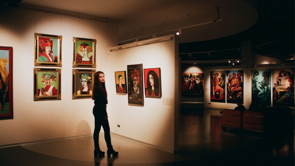
Balancing Variety and Consistency
Gallery-style layouts often combine different visuals. The key is balancing variety with consistency.
Tips for maintaining balance:
- Use a consistent colour palette
- Limit font variations
- Keep spacing uniform
- Align edges and margins
- Avoid overcrowding
Consistency keeps layouts cohesive.
Spacing and Negative Space
Negative space plays an important role in visual composition. Proper spacing allows each visual to stand out.
Benefits of negative space:
- Reduces visual clutter
- Improves readability
- Enhances focus
- Creates breathing room
- Strengthens composition
Spacing improves overall balance.
Aligning Visual Elements
Alignment ensures a clean and organised gallery-style layout. Consistent alignment helps create structure.
Alignment tips:
- Use consistent margins
- Align edges horizontally or vertically
- Maintain equal spacing
- Group related visuals
- Follow a structured grid
Alignment enhances presentation.
Mixing Sizes for Dynamic Composition
Varying image sizes adds visual interest while maintaining cohesion.
Balanced size variation may include:
- Large focal images
- Medium supporting visuals
- Smaller detail images
- Consistent spacing between sizes
- Structured placement
Size variation adds depth.
Applying Gallery-Style Layouts Digitally
Gallery-style composition works well for:
- Portfolio pages
- Creative websites
- Digital galleries
- Presentation slides
- Social media layouts
Consistent composition improves user experience.
Tips for Building Cohesive Gallery Layouts
To improve visual composition:
- Start with a grid
- Choose a consistent style
- Use balanced spacing
- Create clear hierarchy
- Limit visual clutter
- Maintain alignment
These tips help create professional layouts.
Final Thoughts
Creative visual composition is key to building cohesive gallery-style layouts. By using structured grids, balanced spacing, and consistent visual elements, designers can create layouts that feel curated and engaging.
Whether used for digital or physical displays, thoughtful composition helps unify visuals, improve storytelling, and enhance overall presentation quality.
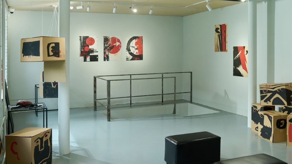
Modern Gallery Inspiration: Creating Balanced Visual Collection
Modern gallery spaces are defined by thoughtful curation, visual harmony, and intentional presentation. Creating a balanced visual collection is essential for showcasing artwork effectively while guiding viewers through a cohesive experience. Whether for physical galleries, digital exhibitions, or curated creative displays, balance plays a key role in making collections feel polished and engaging.
This article explores modern gallery inspiration and how to create a balanced visual collection that enhances presentation and storytelling.
What Is a Balanced Visual Collection?
A balanced visual collection is a carefully curated arrangement of artworks or visuals that complement each other in style, colour, scale, and composition. Instead of competing for attention, each piece contributes to a unified presentation.
Balanced collections often focus on:
- Consistent visual themes
- Complementary colour palettes
- Varied but harmonious layouts
- Controlled spacing and flow
- Clear visual hierarchy
These elements help create a cohesive gallery experience.
Why Balance Matters in Modern Galleries
Balance ensures that viewers can comfortably explore a collection without feeling overwhelmed. A well-balanced display enhances clarity and encourages engagement.
Benefits of balanced visual collections include:
- Improved viewing experience
- Stronger visual storytelling
- Professional presentation
- Better artwork emphasis
- Clear thematic direction
Balance helps unify diverse pieces.
Creating a Cohesive Visual Theme
Modern galleries often build collections around a shared theme. This could be based on colour, subject matter, style, or mood.
Ways to create cohesion:
- Select artworks with similar tones
- Use complementary colour palettes
- Maintain consistent framing styles
- Align subject matter or concept
- Choose a unified presentation format
A clear theme strengthens the collection.
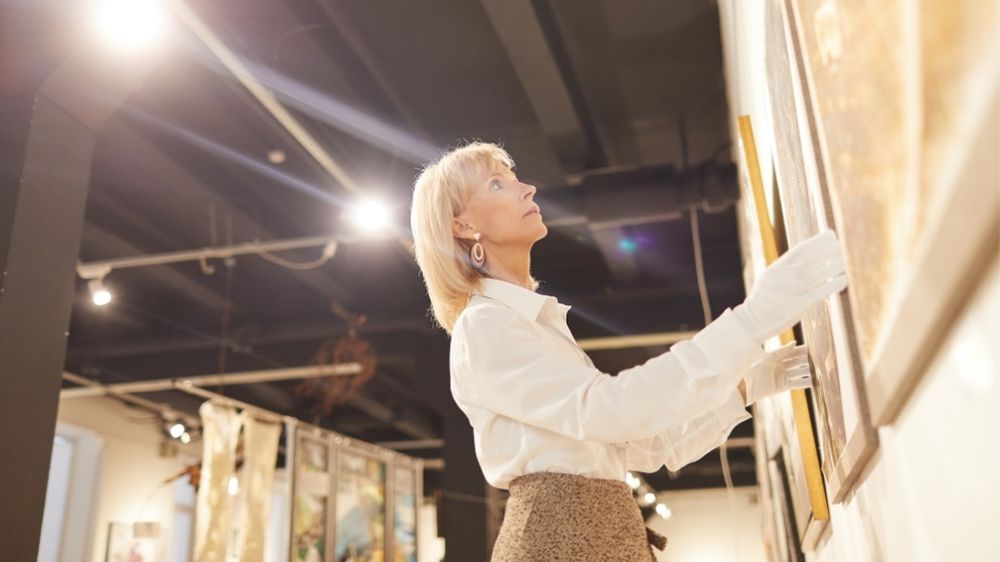
Using Contrast for Visual Interest
While balance is important, contrast adds depth and keeps the collection engaging. Mixing sizes, styles, or tones carefully can enhance visual impact.
Balanced contrast may include:
- Large and small artworks
- Light and dark tones
- Minimal and detailed pieces
- Horizontal and vertical layouts
- Bold and subtle visuals
Contrast should enhance, not overpower.
Spacing and Layout Considerations
Spacing plays a major role in achieving balance. Proper placement prevents clutter and allows each piece to stand out.
Layout tips:
- Maintain consistent spacing
- Avoid overcrowding walls
- Group related pieces together
- Use alignment for structure
- Allow breathing room between works
Good spacing improves flow.
Creating Visual Flow
A balanced collection should guide viewers naturally from one piece to the next. Visual flow helps create a cohesive journey.
Ways to improve flow:
- Arrange by colour progression
- Group by theme or subject
- Use size transitions
- Align visual focal points
- Maintain consistent spacing
Flow enhances viewer engagement.
Mixing Styles While Maintaining Balance
Modern galleries often combine different styles. The key is maintaining harmony while allowing variety.
Tips for mixing styles:
- Use a consistent colour palette
- Balance bold pieces with minimal ones
- Maintain similar framing or presentation
- Keep layout structured
- Avoid too many competing elements
This keeps the collection cohesive.
Digital Gallery Inspiration
Balanced visual collections are also important in digital galleries and online portfolios. Structure and consistency improve user experience.
Digital gallery tips:
- Use consistent image sizes
- Maintain grid alignment
- Limit visual clutter
- Create spacing between items
- Use clear navigation flow
Digital balance improves presentation.
Building a Modern Gallery Aesthetic
Modern gallery inspiration often focuses on:
- Minimalist presentation
- Clean layouts
- Neutral backgrounds
- Thoughtful spacing
- Curated visual groupings
These elements create a refined look.
Final Thoughts
Creating a balanced visual collection is essential for modern gallery presentation. By combining cohesive themes, thoughtful spacing, and controlled contrast, galleries can showcase artwork in a way that feels intentional and engaging.
Whether designing a physical exhibition or digital gallery, balance helps unify visuals, improve flow, and enhance the overall viewing experience.

How Visual Curation Improves Creative Presentation and Design Ideas
Visual curation plays an important role in shaping creative presentation and developing strong design ideas. By thoughtfully selecting, organising, and presenting visual elements, creatives can communicate concepts more effectively and create cohesive, engaging experiences. Whether used in design, branding, exhibitions, or digital content, visual curation helps transform ideas into compelling visual narratives.
This article explores how visual curation improves creative presentation and supports better design thinking.
What Is Visual Curation?
Visual curation is the process of selecting and arranging images, colours, typography, and design elements to communicate a clear message or theme. Instead of presenting visuals randomly, curated content follows a purposeful structure that enhances storytelling and clarity.
Visual curation may include:
- Selecting complementary images
- Organising layouts and composition
- Creating consistent colour palettes
- Defining visual hierarchy
- Aligning style and tone
These elements work together to strengthen presentation.
Why Visual Curation Matters in Creative Work
Without curation, visual content can feel disorganised and inconsistent. A curated approach helps create clarity and impact.
Benefits of visual curation include:
- Stronger visual storytelling
- More cohesive design direction
- Improved audience engagement
- Clearer communication of ideas
- Professional presentation quality
Curated visuals make concepts easier to understand.
Creating Cohesive Design Ideas
Visual curation helps designers build consistent themes. By selecting visuals that share a similar style, tone, or colour palette, creatives can develop more cohesive design ideas.
Ways curation supports cohesion:
- Consistent colour choices
- Matching typography styles
- Unified image tone
- Balanced layout structure
- Clear visual direction
Consistency improves overall design quality.
Improving Visual Hierarchy
A key part of visual curation is establishing hierarchy. This guides viewers through content in a logical order.
Effective visual hierarchy includes:
- Clear focal points
- Balanced spacing
- Size variation for emphasis
- Logical grouping of elements
- Structured layout flow
Hierarchy improves readability and impact.
Enhancing Creative Presentation
Curated visuals help present ideas more effectively, whether for portfolios, design proposals, or creative projects.
Presentation improvements include:
- Cleaner layouts
- More organised content
- Stronger storytelling
- Better audience focus
- Professional appearance
Visual curation elevates presentation quality.
Supporting Inspiration and Idea Development
Visual curation also helps spark creativity. Collecting and organising visual references allows designers to explore ideas and identify patterns.
Creative benefits include:
- Discovering new styles
- Exploring colour combinations
- Testing layout ideas
- Identifying design trends
- Building mood boards
Curated inspiration supports better design thinking.
Creating Balance and Composition
Thoughtful visual curation improves balance within a design. Proper spacing, alignment, and element placement create a more polished look.
Balanced composition includes:
- Even spacing
- Alignment consistency
- Visual weight distribution
- Complementary elements
- Clear structure
Balance improves user experience.
Strengthening Visual Storytelling
Curated visuals help communicate a story. By carefully selecting images and arranging them intentionally, creatives can guide viewers through a narrative.
Visual storytelling benefits:
- Clear message delivery
- Emotional engagement
- Structured narrative flow
- Stronger concept communication
- Memorable presentation
Story-driven visuals are more impactful.
Applying Visual Curation Across Projects
Visual curation can be used in many creative contexts:
- Design presentations
- Branding concepts
- Digital content layouts
- Portfolio showcases
- Exhibition planning
- Creative mood boards
Its flexibility makes it valuable across disciplines.
Tips for Effective Visual Curation
To improve visual curation:
- Choose a consistent style
- Limit colour palette
- Maintain visual balance
- Use clear hierarchy
- Avoid overcrowding
- Focus on storytelling
These tips improve clarity and cohesion.
Final Thoughts
Visual curation is a powerful tool for improving creative presentation and developing stronger design ideas. By carefully selecting and organising visual elements, creatives can communicate concepts more effectively and create cohesive, engaging experiences.
Whether used for inspiration, layout design, or storytelling, visual curation helps transform ideas into polished and impactful visual presentations.